

Interactive seating chart
Make your seating chart clickable — section by section.
Upload the chart you already have, hotspot every section, and let buyers see capacity, price, and the actual view from those seats before they commit.
Free forever plan · No credit card · Works in Wix, Webflow, WordPress, Shopify, Squarespace
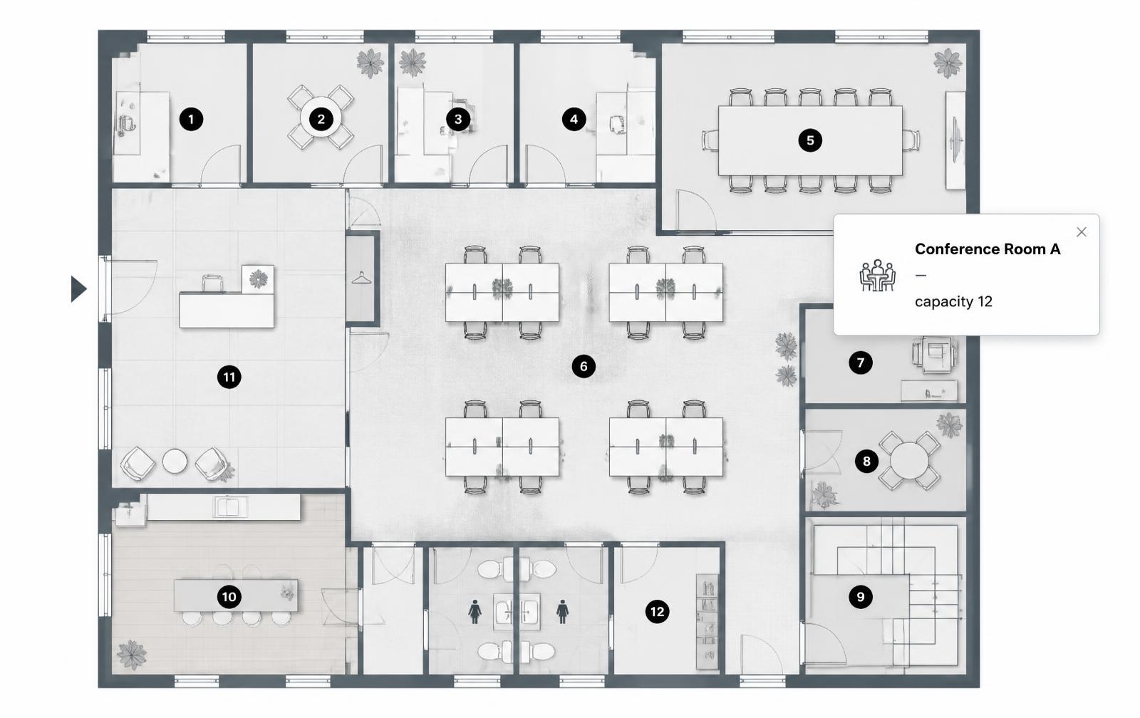
One hotspot per section
Section name, capacity, price band, a view photo, and a ticket link live in the popup.
Colour-coded price tiers
Categories let you shade premium, standard, and value blocks so the pricing reads off the chart.
One iframe to embed
Paste a single snippet into your event page, ticketing landing page, or venue site.
What you get
- Works with any chart image — venue map, bowl diagram, theater layout, banquet plan
- Capacity, price, and accessibility notes per section
- View-from-seat photos inside each popup
- Deep-link each section to its ticketing page
- Numbered markers for tables and rows
- Embeds in Wix, Webflow, WordPress, Squarespace, and Shopify
What this is — and what it isn't
Interactive Image is an interactive seating chart tool, not a seating chart generator. It does not lay out rows, calculate sightlines, count seats, or hold live ticket inventory. Produce the chart itself in your venue or ticketing software first.
What it does is the step almost everyone skips: taking that finished chart — usually a flat PNG or a PDF page — and making every section answer its own questions. Most venues already have a perfectly good chart that buyers can't interrogate.
Try it on a real layout
Hover or keyboard-focus the markers. Each is a section hotspot with its own popup — exactly what the editor produces, with your chart and your copy.
Four steps, about ten minutes
- Upload the chart. PNG or JPEG around 1600–2000px wide, cropped to the seating area itself.
- Place a marker per section. Click inside each block or table, then drag to centre it.
- Fill in the popups. Name and capacity as a baseline; price, view photo, and ticket link on the sections that sell.
- Copy the embed. One iframe into your event page. Later edits propagate everywhere it appears.
What to put in each section popup
| Content | When to include it |
|---|---|
| Section name and capacity | Every section, as a baseline |
| Price or price band | Any ticketed event — it is the first thing buyers look for |
| View-from-seat photo | Premium blocks, and any section people hesitate over |
| Accessibility notes | Step-free access, companion seats, sightline restrictions |
| Buy-tickets CTA | Every section that is on sale, deep-linked where your provider allows it |
Theaters, arenas, and concert venues
A bowl or auditorium diagram tells buyers where a block sits but nothing about what they will see from it. Hotspotting each block with a stage photo and a price band removes the main hesitation before checkout, and it cuts the "what's the view like from section 214?" emails your box office answers every week.
Conferences, banquets, and weddings
For a seated dinner or a conference room set, the chart becomes a directory: table numbers, who is seated where, dietary flags, and AV notes per table. Numbered markers map straight onto table numbers, and because the embed is a link as well, you can share it with a planner or a caterer without giving anyone editor access. Venue-side detail lives in the hospitality use case.
Stadiums and multi-tier bowls
Large venues have the opposite problem: too many sections to hotspot individually without clutter. Group by tier — lower bowl, club, upper — using colour-coded categories, hotspot at the block level rather than the row level, and keep popup copy to two lines. Roughly 40–50 markers is the practical readability ceiling on one image; beyond that, split the chart per tier and link them together.
Why not an HTML image map?
A seating chart is the classic case people reach for <area> polygons for, and the classic case where it falls apart: dozens of irregular blocks in fixed pixel coordinates that drift off the chart the moment the image scales on a phone. The image map generator page covers the percentage-based alternative, and why hotspots drift on mobile explains the underlying maths.
Frequently asked questions
Do I need to draw the seating layout here?
No. Interactive Image is not a seating chart generator — it makes an existing chart image clickable. Export the chart from your venue or ticketing software first.
Does it connect to live ticket inventory?
No. Availability and pricing in popups are text you edit, so it suits per-show updates rather than real-time inventory. Link the CTA at your ticketing provider to keep live availability in one place.
How many sections can one chart have?
There is no hard limit, including on the free plan. Charts stay readable to roughly 40–50 markers; for a large stadium, hotspot at block level or split the chart by tier.
Can guests view it without an account?
Yes. The embed and its public link are open to anyone — no sign-in, no app.
Is there a free plan?
Yes. The free plan covers one image with a limited hotspot allowance and shows an Interactive Image watermark. Pro removes the watermark and lifts the image limit.
Need it built for you?
Big maps, bulk hotspots, custom designs or integrations, built by our team at Upcode.
Turn any image into a guided experience.
Free forever plan. Paste one iframe into your site and ship.
Create your interactive image