

How-to
How to make an interactive map for a website.
Build with your own plan or illustration, or start from a geographic Mapbox map for real addresses. Both use rich location cards and a website embed.
Free forever plan · No credit card · Works in Wix, Webflow, WordPress, Shopify, Squarespace
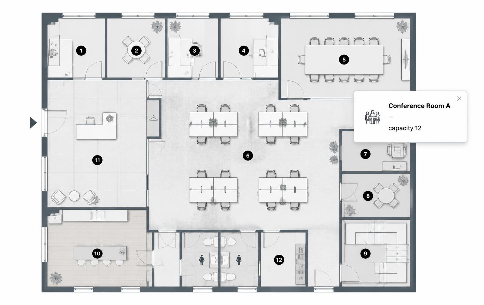
Try it now with your own map image
Upload a floor plan, campus map, or venue layout, click to drop markers, and hover to see the cards. Publish it and get your website embed with a free account.
This is a live demo — nothing here is published yet. Create a free account to publish your image and get a one-line embed code for Wix, Webflow, WordPress, Squarespace or plain HTML, with hosted images, images and video in the cards, CTA buttons and edits that go live instantly. Free includes 1 published image with the Interactive Image badge; Pro removes the badge and unlocks white-label embeds.
No API key, no billing
Your own map image, not a licensed geographic dataset — nothing to provision.
Markers as percentages
Every location stays on target from desktop down to a 390px phone.
One embed, any builder
Paste a single snippet into Wix, WordPress, Webflow, Squarespace, Shopify, or plain HTML.
What you get
- Works from a floor plan, campus map, venue layout, or illustrated region
- Each marker gets a title, description, photo, and link
- Categories to group markers on busy maps
- Tap-friendly cards on mobile, hover on desktop
- Free plan includes one map with a limited hotspot allowance
The geographic map workflow
Choose Mapbox map in New Map. Search an address and choose Add pin, or open Import locations for a CSV or published Google Sheet. Match columns and review coordinates before importing. CSV addresses can be looked up; connected Sheets require coordinates and a stable ID for each row.
Open a location's Content section to choose its type and add details, photos, and links. Appearance customizes that location; Map settings holds shared defaults and visitor controls. Use Draw on map for paths, areas, and coverage radii, then Set starting view to save the initial map view.
Enable the visitor search, filters, location list, clustering, and directions options your audience needs. Check the published embed on a phone. The image-map walkthrough below applies when you chose Image map; map types cannot be switched after creation.
First decide which kind of map you need
"Interactive map" covers two genuinely different things, and picking the wrong one costs days. Be honest about which job you have:
| You need | Use | Why |
|---|---|---|
| Search, driving directions, street-level zoom, live geodata | A geographic platform (Google Maps, Mapbox) | Real coordinates and a maintained basemap; needs an API key and usually billing |
| Thousands of rows shaded by value, from a spreadsheet | A data-visualisation tool | Built for choropleths and data joins |
| A plan, campus, venue, resort, stand layout, or branded region illustration | An image-based interactive map | None of it exists in a geographic dataset; you want your artwork, with markers on it |
Most searches for "interactive map for my website" turn out to be the third row: a picture of a place, with clickable points. That's what the rest of this page covers.
Step 1 — prepare the map image
- Export at ~2× display width. A map shown at 1000px wants a roughly 2000px file so labels stay legible on retina screens.
- PNG for line art, JPG for renders. Plans and illustrations are mostly flat colour and type — PNG keeps the edges clean.
- Trim dead space. Crop the borders before uploading, not after — markers are positioned relative to the file you upload.
- Simplify the artwork. If the base image already labels everything, the markers compete with it. Strip the labels and let the cards carry the text.
- Avoid extreme aspect ratios. A 4:1 panorama letterboxes hard on phones. Nearer 3:2 or 4:3 travels better.
Coming from CAD or a PDF? The floor plan image prep guide covers export settings from AutoCAD, Revit, SketchUp, and PDF specifically.
Step 2 — place the markers
Upload the image, then click each location to drop a marker and drag to fine-tune. A few things that make the difference between a map people use and one they abandon:
- Number them if there's an order. A tour, a process, or a route reads far better numbered than as identical dots.
- Keep markers ~32px apart. Closer than that and a thumb can't reliably hit the one it's aiming at.
- Contrast against the artwork. Dark markers on a pale plan, light markers on a dark render. Busy photography may need a subtle halo.
- Use categories on dense maps. Entrances, amenities, and departments as separate groups lets visitors filter mentally.
Step 3 — write cards people actually read
A marker card is not a paragraph. The shape that works: a short specific title, one or two lines of the fact the visitor came for, an optional photo, and exactly one link.
- Title = the name they'd say out loud. "Suite 204", "North Entrance", "Conference Room A".
- Body = the deciding detail. Capacity, price, availability, opening hours — not marketing copy.
- One CTA. "See the unit", "Book this room", "View the department". Two buttons halve the click-through on both.
- A photo where it settles the question. A room, a stand, a view. Skip it if it's decorative — it just makes the card taller on phones.
Step 4 — embed it and check the phone
Publishing produces one responsive iframe snippet. Paste it into your builder's embed or HTML block — there are exact click paths for Wix, WordPress, Webflow, Squarespace, Shopify, and Google Sites.
Then open the live page on an actual phone. Check three things: no scrollbar inside the embed, every marker still over its location, and the cards readable without pinch-zoom. If markers look shifted, the container is forcing a height that differs from the image's ratio — see why hotspots drift on mobile.
Maps teams build most often
Office and building plans (interactive office floor plan), property listings (interactive floor plan), hotels and resorts (interactive hotel map), events and venues (interactive seating chart), campuses (education), and museums (exhibit maps). The general-purpose starting point is the interactive map maker.
Need it built for you?
Big maps, bulk hotspots, custom designs or integrations, built by our team at Upcode.
Turn any image into a guided experience.
Free forever plan. Paste one iframe into your site and ship.
Create your interactive image