

Blog
Accessibility for interactive images and image maps
Practical, WCAG-oriented guidance for making clickable hotspots usable with a keyboard, a screen reader, and low vision — not just a mouse.
Free forever plan · No credit card · Works in Wix, Webflow, WordPress, Shopify, Squarespace
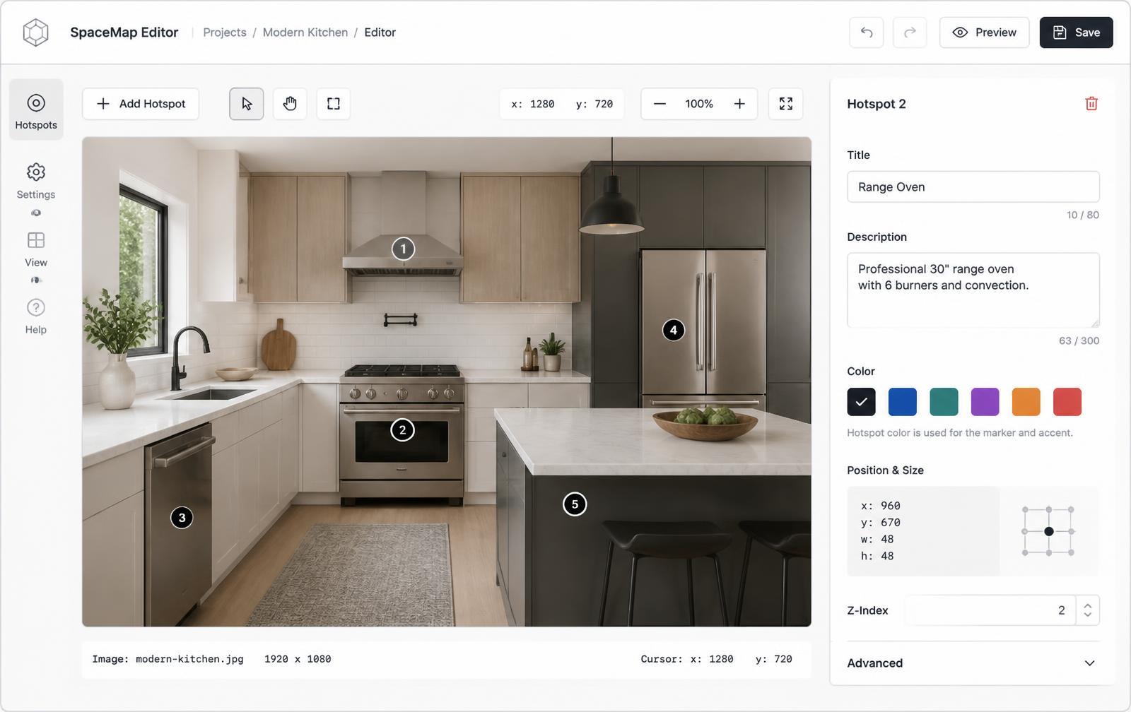
Keyboard-first hotspots
Every hotspot is a real focusable button, reachable with Tab and activated with Enter or Space.
Meaningful alt text
Base images and hotspots carry accessible names that describe content, not just position.
Visible focus states
Clear focus outlines so keyboard users always know which hotspot is active.
What you get
- Real buttons or links for every hotspot, not click-only divs
- Visible, high-contrast focus states
- Descriptive accessible names, not positional labels
- aria-expanded and aria-controls for popup relationships
- At least 24x24px effective touch target per hotspot
Updated
Check each content type, not just the default card
A dot can now represent Info, Product, Media, Step, Link, or Location. Give each a descriptive title and make its destination or action clear; do not rely on the marker icon or color alone. Recheck keyboard operation, focus, contrast, and mobile targets after changing a type or its opening behavior. A theme or preset is a starting point, not a guarantee that your finished embed meets an accessibility standard.
Why interactive images need deliberate accessibility work
An interactive image adds a layer of interaction on top of a static picture — clickable dots, popups, sometimes video or forms. Every one of those additions is invisible to a user who can't see the picture or can't operate a mouse, unless it's built with accessibility in mind from the start. That means keyboard operability, sensible alt text, ARIA relationships between hotspots and their content, and enough color contrast for markers to be visible in the first place.
Why legacy HTML image maps fall short
The original HTML <map> and <area> elements have been around since the 1990s and technically support an alt attribute per area. In practice, they fall short of modern accessibility expectations in several ways:
| Limitation | Impact |
|---|---|
| Pixel-based coordinates | Hotspots drift off-target when the image is resized responsively, including via browser zoom |
| No visible focus styling by default | Keyboard users can't easily tell which area is currently focused |
| Simple alt text only | No structured way to expose rich popup content — prices, galleries, forms — to assistive tech |
| No touch target guidance | Small areas defined in markup are hard to hit on touchscreens regardless of visual marker size |
Our HTML image map alternative guide covers the broader technical case for moving away from <map>/<area>; accessibility is one of the strongest reasons.
Keyboard operability
- Build each hotspot as a real
<button>or<a>, not a<div>with an onClick handler — this gets you keyboard focusability and correct semantics for free. - Ensure Tab order moves through hotspots in a logical sequence, generally matching reading order (left-to-right, top-to-bottom) rather than DOM insertion order if they differ.
- Support both Enter and Space to open a popup, matching native button behavior.
- Support Escape to close an open popup and return focus to the hotspot that opened it.
Visible focus and contrast
A keyboard user needs to see where focus is at all times. Don't remove the default focus outline without replacing it with something equally visible — a 2px outline with sufficient contrast against both light and dark parts of the underlying photo works well. Because hotspots sit on top of photographic content with unpredictable colors, a focus ring with its own contrasting background (a small halo or shadow) tends to hold up better than a simple outline color.
Hotspot markers themselves should meet the same 3:1 contrast ratio WCAG requires for other non-text UI elements against their immediate background, which sometimes means adding a subtle shadow or ring around a marker placed on a busy or low-contrast area of the image.
Alt text and accessible names
Give the base image itself a concise alt attribute describing the overall scene, exactly as you would for any other content image. Then give each hotspot its own accessible name — via visible text, anaria-label, or aria-labelledby — that describes what it reveals rather than just its position. "Hotspot 3" tells a screen reader user nothing useful; "Living room details" or "Wireless earbuds, $59" does.
When a hotspot opens a popup, use aria-expanded on the trigger and aria-controls pointing at the popup's id, so assistive technology can announce the relationship and current state.
Touch targets and mobile considerations
WCAG 2.2's target size success criterion recommends a minimum of 24 by 24 CSS pixels for interactive targets, with more generous sizing preferred, especially on touch devices where fingers are far less precise than a mouse cursor. A small visual dot marker can still have a much larger invisible tap area around it — this keeps the design clean while making hotspots easy to hit for users with motor impairments or anyone using a phone one-handed.
Testing your interactive image for accessibility
- Unplug your mouse and try to reach and activate every hotspot using only Tab, Shift+Tab, Enter, Space, and Escape.
- Turn on a screen reader (VoiceOver, NVDA, or JAWS) and confirm each hotspot announces a meaningful name and its expanded/collapsed state.
- Zoom your browser to 200% and confirm hotspots still land on their intended targets and popups remain readable.
- Check color contrast of markers and text using a contrast checker against the actual image background, not just a neutral swatch.
For more on building interactive images the right way from the start, see our step-by-step guide to making an interactive image and browse real examples, or read a general primer on what an interactive image is.
Frequently asked questions
Is an accessible interactive image slower to build?
Not meaningfully — using semantic buttons, meaningful labels, and standard ARIA attributes from the start adds only a few extra minutes per hotspot compared to skipping accessibility entirely.
Do screen readers announce image map areas well?
Support is inconsistent across browsers and screen readers. Modern hotspot-based interactive images built with real buttons and ARIA attributes are announced far more reliably.
Turn any image into a guided experience.
Free forever plan. Paste one iframe into your site and ship.
Create your interactive image