

Blog
How to make an interactive image, step by step
From choosing the right source photo to exporting the right size and embedding the final result — the complete workflow for building a clickable interactive image.
Free forever plan · No credit card · Works in Wix, Webflow, WordPress, Shopify, Squarespace
No design software needed
Upload any image and place hotspots directly on it in the browser.
Percentage-based coordinates
Hotspots stay glued to the right spot on every screen size, from phone to desktop.
One iframe to embed
Ship the finished interactive image on any site with a single embed snippet.
What you get
- Prep and crop your image before uploading
- Export at 1600–2400px wide for hero placements
- Use percentage-based hotspots for true responsiveness
- Preview at mobile, tablet, and desktop widths
- Publish with a single iframe embed
Updated
Start in the current editor
In your dashboard, choose New Map, then Image map. Select Upload Background Image, then Add new dot and click the detail you want to explain. In Content, choose Info, Product, Media, Step, Link, or Location and complete the relevant fields. Use Appearance for this dot and Map settings for shared defaults. Preview the selected dot and check Desktop, Tablet, and Mobile before enabling the embed.
1. Choose and prepare your source image
Every interactive image starts with a single flat image — a photo, floor plan, diagram, screenshot, or illustration. Before you touch any hotspot tool, get the source image right, because the image quality and framing determine how good the final result looks on every device.
- Crop tightly to the content you want people to explore — remove empty margins that waste screen space.
- Use a consistent aspect ratio if you're building a series (product shots, room photos, diagrams).
- Avoid text baked into the image if you can add it as a hotspot label instead — it stays crisp at every size.
- Flatten layered files (PSD, AI, Figma) into a single JPEG or PNG before uploading.
2. Pick the right export size and format
Interactive images are displayed responsively, so you don't need to export multiple sizes for different breakpoints — one well-sized master image is enough. As a rule of thumb:
| Use case | Recommended width | Format |
|---|---|---|
| Full-width hero / landing page | 1800–2400px | JPEG or WebP |
| Product or lifestyle photo | 1200–1600px | JPEG |
| Floor plan / diagram / screenshot | 1600–2000px | PNG |
| Embedded widget in a sidebar | 800–1000px | JPEG or WebP |
Oversized images slow page load without improving hotspot accuracy, because coordinates are stored as percentages of the image dimensions, not as fixed pixel offsets.
3. Upload the image and place hotspots
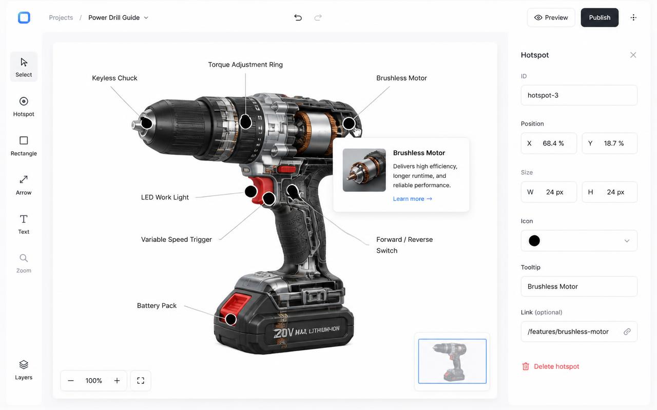
Once your image is ready, upload it into an interactive image maker. In the account editor, use Add new dot, then click the image to place it. Each hotspot needs:
- A clear, short label — think "Living room" or "Wireless earbuds," not a full sentence.
- A popup with more detail: text, an image, a video, a price, or a link.
- An optional action, like linking to a product page, a PDF, or another interactive image.
For a deeper walkthrough on hotspot placement itself, see our guide on how to add hotspots to an image.
4. Understand percentage-based coordinates
The single most important technical detail behind a responsive interactive image is how hotspot positions are stored. Legacy HTML <map>/<area> image maps store coordinates in raw pixels tied to one specific image size — resize the image and every hotspot drifts off target.
Modern tools instead store each hotspot as a percentage of the image's width and height (for example, "42% across, 18% down"). Because the percentage scales with the image container, the hotspot lands in the same visual spot whether the image is rendered at 300px or 3000px wide. This is what makes an interactive image genuinely responsive, and it's worth confirming any tool you use — including our image map generator — supports it before you invest time building hotspots. For a broader comparison of the two approaches, read why HTML image maps fall short today.
5. Preview across devices before publishing
Before you ship, check the interactive image at a few common breakpoints: a small phone width (around 375px), a tablet width (around 768px), and a desktop width (1440px or wider). Confirm that:
- Hotspots still sit on the intended detail (a product's zipper, a room's doorway, a chart's data point).
- Popup cards don't overflow the viewport on mobile — they should reflow to fit the screen.
- Text inside popups stays legible at small sizes; trim copy that only made sense at desktop width.
If you're designing for a specific device mix — say, a mostly mobile audience browsing product photos — our guide on the responsive image map generator covers additional breakpoint considerations.
6. Embed the finished interactive image
Once you're happy with the hotspot placement and popups, publishing is the easy part: copy a single iframe snippet and paste it into your site's HTML, CMS embed block, or page builder.
- Wix: paste into an Embed HTML element.
- WordPress: paste into a Custom HTML block.
- Webflow: paste into an Embed component.
Because the embed is a single iframe, updating the hotspots later — adding a product, fixing a label, swapping a photo — takes effect everywhere the embed is used, without touching the site's code again.
7. Where to go from here
If you want inspiration before starting, browse real interactive image examples, compare tools on the comparison hub, or read a broader introduction on what an interactive image actually is. When you're ready to try building one, the clickable image maker is a good starting point for photos and diagrams alike.
Frequently asked questions
How long does it take to make an interactive image?
A simple image with 3–6 hotspots typically takes 10–20 minutes once the source image is ready, including writing popup copy.
Can I reuse the same interactive image on multiple pages?
Yes. Embed the same iframe on as many pages as you like; edits to the hotspots update everywhere automatically.
Turn any image into a guided experience.
Free forever plan. Paste one iframe into your site and ship.
Create your interactive image