

Popup cards
Give every hotspot a card people can understand.
Add the right amount of context to the exact part of an image or map a visitor is exploring — without sending them to a separate page for every detail.
Free forever plan · No credit card · Works in Wix, Webflow, WordPress, Shopify, Squarespace
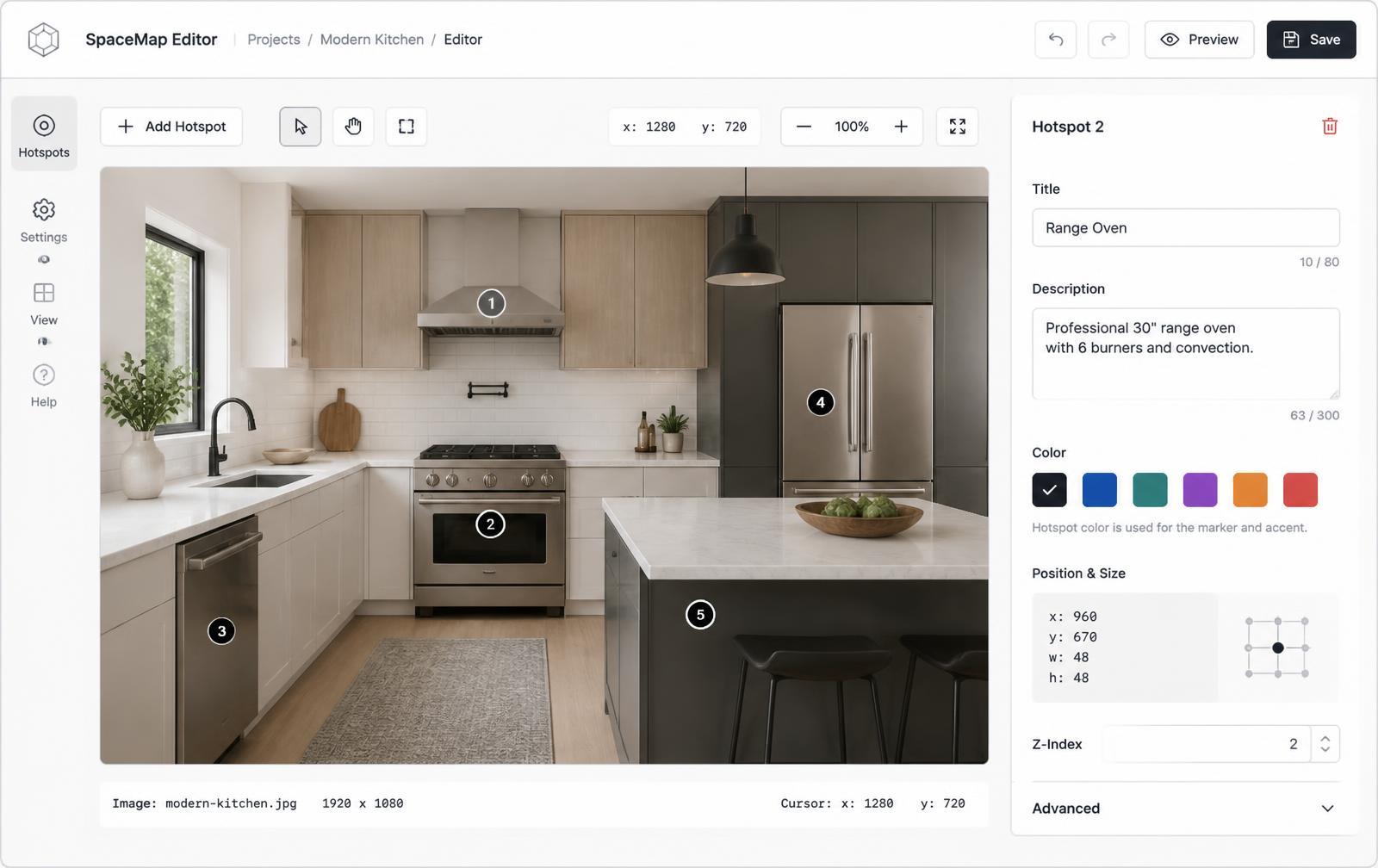
Context in place
Explain a feature, room, or location right beside the marker instead of making visitors hunt for a legend.
Media when it helps
Add an image, video, or short link when words alone are not enough to explain the detail.
Cards that adapt
Choose light, dark, or glass styling and let the card become a full-width panel on small screens.
What you get
- Title and description for every hotspot
- Optional image or video inside the card
- CTA buttons for products, docs, and bookings
- Light, dark, and glass card themes
- Hover, click, focus, and touch behavior
- Percentage positioning that stays aligned on mobile
A card should answer the next question
A good popup is not a second landing page. It answers the question that appears when someone notices a specific part of the visual: What is this? Why does it matter? What should I do next?
Name the detail
Use a short, specific title that makes sense out of context.
Add the useful detail
Write one or two sentences that explain the visible thing.
Show it when needed
Use a supporting image or video for anything visual or procedural.
Offer a next step
Link to specs, a booking page, a product, or a deeper guide.
See the card behavior
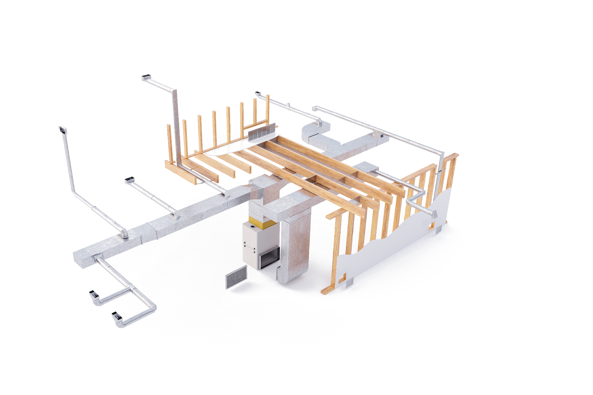
The markers in this example are real focusable controls. Hover or focus one to preview its card, then use the same pattern for product diagrams, floor plans, venue maps, or shoppable photography.
Popup, map view, or lightbox?
Choose the action based on how much information belongs behind the hotspot. Popup cards are best for quick context. Map views are useful when a point needs geography or directions. Lightboxes give a detail its own focused space with more room for media.
| Action | Best for | Typical content |
|---|---|---|
| Popup card | Fast explanations | Title, short copy, CTA |
| Map view | Places and directions | Location, map, address, link |
| Lightbox | Focused detail | Large image, video, longer copy |
Cards that work on phones
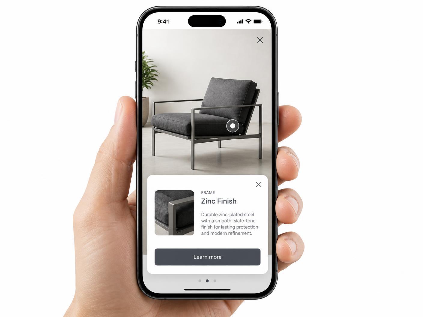
On desktop, a popup can sit beside the marker and stay lightweight. On a phone, the same card becomes a larger tap-friendly surface so descriptions, media, and buttons remain readable. Because the marker is stored as a percentage of the image, it does not drift as the layout changes.
Build the visual once, keep the cards current
Publish one iframe into Wix, Webflow, WordPress, Shopify, Squarespace, or custom HTML. When a title, card image, link, or description changes in the builder, the published experience updates everywhere it is embedded. Start with the interactive image maker or explore the companion lightbox experience.
Continue exploring
Turn any image into a guided experience.
Free forever plan. Paste one iframe into your site and ship.
Create your interactive image